
colour considered
When it comes to shaping a Tailored Home, few decisions are as transformative or as personal as paint. Colour sets the tone, defines the architecture, and quietly influences how a space feels from morning light to evening glow. With the right palette, paint becomes more than a backdrop. It becomes a defining layer of the design.
And truly, I could not be happier to say, colour is back. Not in a trend-driven way, but in a deeply personal, expressive way that allows homes to feel layered, lived-in, and entirely unique.
setting tone
Neutrals are often a strong starting point when building a cohesive palette. Warm whites, soft greiges, and complex taupes create a sense of balance and allow architectural details, furnishings, and finishes to take the lead. Benjamin Moore remains a trusted go-to for these tones. White Dove, Simply White, and Swiss Coffee offer versatility and subtle depth.
That said, today’s homes are far more personal and far more expressive. This is where the palette truly comes to life. In our work, we often lean into richer, more saturated colours to create mood and distinction. Farrow and Ball is unmatched in this space. Their pigments have a depth and complexity that shift beautifully throughout the day, bringing a sense of character that feels layered rather than flat. Shades like Setting Plaster, Stiffkey Blue, and Douter allow a home to feel expressive, elevated, and entirely its own.
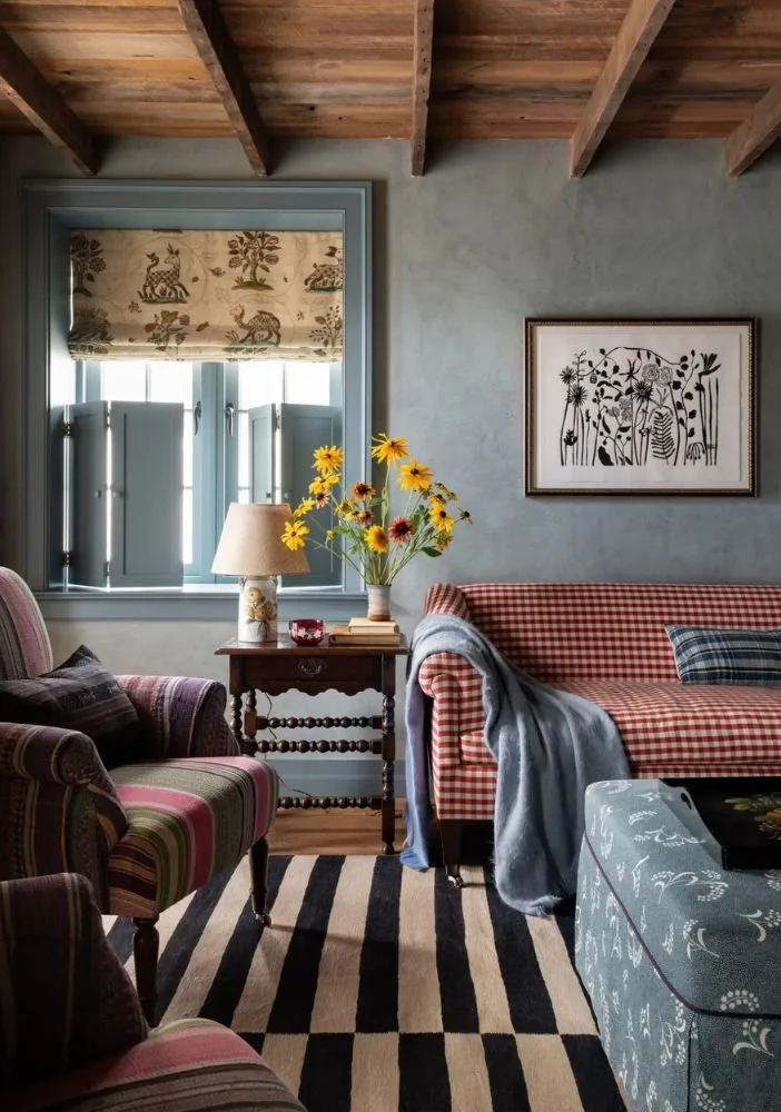
Source: Heidi Callier Design
embracing depth
For trim elements like window casings and baseboards, often times I prefer a more tonal approach. Using the same paint colour as the walls, but in a different sheen, creates a subtle contrast without disrupting the overall flow of the space. It allows everything to feel cohesive and quietly elevated.
That said, when trim is highly architectural or designed to be a true feature, I absolutely lean toward a contrasting colour to highlight those details and give them the attention they deserve.
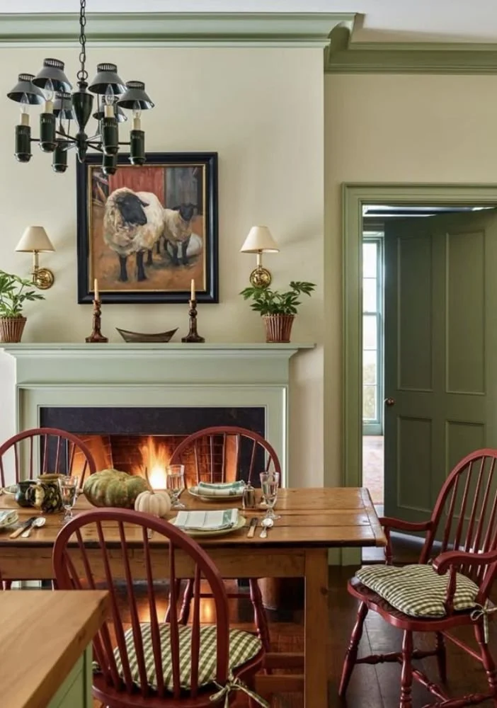
Source: Banchory Farm
refining details
Even the most beautiful colour should be considered in context. How it interacts with natural light, surrounding materials, and adjacent spaces is what ultimately defines its success.
Testing is essential. I always recommend sampling paint on multiple walls and observing it throughout the day. A colour can shift dramatically from morning to evening, and what feels soft and balanced in one light can read entirely different in another.
It is also important to consider how colours transition from one space to the next. A thoughtfully curated palette creates a sense of ease and continuity, allowing your home to feel intentional and well resolved.
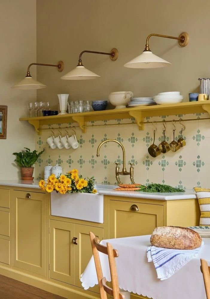
Source: Uns Hobbs Interiors
Ottawa Interior Design | Ottawa Designer | Custom Home Builders | Petawawa | Ottawa | Renfrew | Calabogie | Pembroke | Ottawa Valley Designer | Ottawa Decorating | Vintage Home | Custom Home Design | Toronto | Halliburton | Ottawa Valley Home Build | Home Design | Muskoka | Interior Decorating | Interior Design Tips | Designer Tips | Benjamin Moore | Farrow & Ball | Design Guidance | Interior Designer | Toronto Interior Design | Work With A Designer | Prince Edward County | Home Designer | Paint Colour | Paint Tips and Tricks | Interior Paint Colours | Home Colour Palette | Choosing Paint Colours